 |
|
This chapter explains how to set up dialogue UIs and bark UIs. The Dialogue System uses dialogue UIs to show interactive conversations and onscreen alert messages, and bark UIs to show barks. You can customize how each actor appears in UIs by adding a Dialogue Actor component.
These are the tutorial videos for the Standard Dialogue UI system:
The Dialogue System is UI-independent. This means it can work with any UI system – Unity UI, UI Toolkit, or any other. As long as the UI implements the IDialogueUI C# interface, the Dialogue System will work happily with it.
The Dialogue System ships with several implementations. The primary ones are Standard Dialogue UI for Unity UI and UIToolkit Support for UI Toolkit.
The recommended way to set up a dialogue UI is to use the Dialogue System's Standard Dialogue UI. Alternatively, the Dialogue System can use UI Toolkit, IMGUI, NGUI and several other third party GUI systems, or you can add your own custom UI implementation using a simple C# interface.
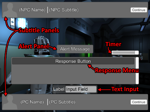
The Standard Dialogue UI is a set of components that manage the UI elements shown in the screenshot above. Those elements are:
All UI elements can be repositioned and reskinned.
The easiest way to start is by assigning a prefab to the Dialogue Manager's Dialogue UI field. The Dialogue System includes a number of graybox templates, as well as finished, professionally designed UIs, located in Prefabs ► Standard UI Prefabs. The graybox templates are:
If you want to design your own layout, it's easiest to start with one of the gray-box templates that behave similarly. Add it to the Dialogue Manager's Canvas, reposition UI elements to your liking, and add replacement images.
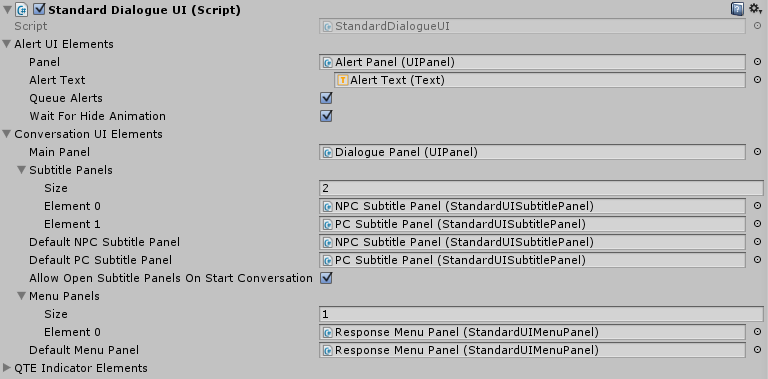
A Standard Dialogue UI typically has one or more subtitle panels and menu panels.
Assign subtitle panels to the Subtitle Panels list. Set Default NPC Subtitle Panel and Default PC Subtitle Panel to specify which panels to use by default for NPCs and the player. Actors that have Dialogue Actor components can specify to use a different panel from the default.
If Allow Open Subtitle Panels On Start Conversation is true, the Dialogue System will check all conversation participants to identify their subtitle panels. If any of those subtitle panels specify that they should open as soon as the conversation starts, it will open them. If you know that none of your panels are configured to open as soon as the conversation starts, you can untick this checkbox to bypass the check.
Assign menus panels to the Menu Panels list. Set Default Menu Panel to the default menu panel. Typically you will only have one menu panel.
In most cases, you'll assign subtitle panels and menu panels that are in the same canvas as the dialogue UI. However, it's perfectly valid to assign panels that are located in different canvases.
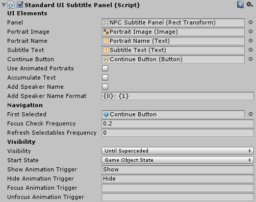
Each subtitle panel has a Standard UI Subtitle Panel component with these properties:
| Property | Function |
|---|---|
| Panel | The main panel. Not mandatory. |
| Portrait Image | Used to show the actor's portrait image. Not mandatory. |
| Portrait Name | Used to show the actor's display name. Not mandatory. |
| Subtitle Text | Used to show the dialogue text. |
| Continue Button | Shown in Continue Button modes. Not mandatory. Add a Standard UI Continue Button Fast Forward to make the first click fast-forward the text. If the Dialogue Manager's Continue Button dropdown is set to a mode that requires continue button clicks, you can override it for a specific conversation by inspecting the conversation and clicking Override Display Settings > Override Subtitle Settings; then change the dropdown there. |
| Use Animated Portraits | Support Animated Portraits. If your actors' portraits aren't animated, untick to bypass its overhead. |
| Accumulate Text | Append dialogue text instead of replacing each line. |
| Add Speaker Name | Prepend the actor's name to the dialogue text. |
| Speaker Name Format | The format in which to prepend the actor's name if Add Speaker Name is ticked. |
| Navigation | — |
| First Selected | In joystick/keyboard mode, start UI navigation on this element. |
| Focus Check Frequency | On this frequency, ensure that some UI element is focused for navigation. |
| Refresh Frequency | On this frequency, refresh the cache of navigable UI elements. |
| Visibility | — |
| Visibility | When subtitle panel should be visible/hidden (see Visibility Options). |
| Start State | The starting state of the panel. |
| Animation Triggers | Animator triggers to control panel visibility (see Panel Animation). |
| Visibility Option | Description |
|---|---|
| OnlyDuringContent | Only visible when actively showing content (e.g., ShowSubtitle). Hidden when done (e.g., HideSubtitle). |
| UntilSuperceded | Appears when showing content (e.g., NPC.ShowSubtitle). Hidden only when content is shown in a different UI section (e.g., PC.ShowSubtitle). |
| AlwaysOnceShown | Appears when showing first content. Never hidden after that until dialogue UI closes. |
| AlwaysFromStart | Appears when dialogue UI opens. Also immediately sets portrait names and images to first actor in conversation that would use panel. |
If a dialogue entry's Sequence is None() or Continue(), the dialogue UI will not display its subtitle.
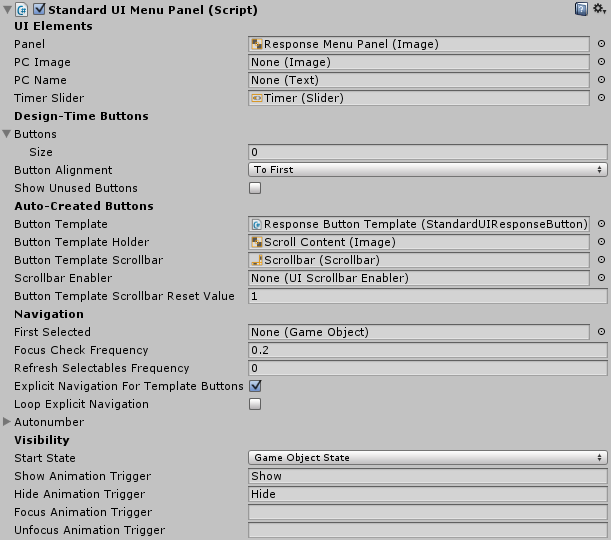
Each menu panel has a Standard UI Menu Panel component with these properties:
| Property | Function |
|---|---|
| Panel | The main panel. Not mandatory. |
| PC Image | Used to show the player's portrait image. Not mandatory. |
| PC Name | Used to show the player's display name. Not mandatory. |
| Timer Slider | Used to show the time left if a response menu timeout is set. Not mandatory. |
| Design-Time Buttons | — |
| Buttons | List of buttons to use for responses. Not mandatory if using Button Template. |
| Button Alignment | If not all buttons are needed, align to the first in the list or the last. |
| Show Unused Buttons | If not all buttons are needed, show the unused buttons as noninteractive. |
| Auto-Created Buttons | — |
| Button Template | Template from which to auto-create response buttons. |
| Button Template Holder | Panel that auto-created buttons will be added to. |
| Button Template Scrollbar | Scrollbar if Button Template Holder is part of a ScrollRect. Not mandatory. |
| Scrollbar Reset Value | When showing a new menu, reset scrollbar to this value. |
| Navigation | — |
| First Selected | In joystick/keyboard mode, start UI navigation on this element. |
| Focus Check Frequency | On this frequency, ensure that some UI element is focused for navigation. |
| Refresh Frequency | On this frequency, refresh the cache of navigable UI elements. |
| Explicit Navigation | Set button UI navigation to Explicit and restrict navigation to the buttons. |
| Loop Explicit Navigation | Navigating down from bottom button loops to top, and vice versa. |
| Autonumber | Autonumber buttons and assign shortcut keys. (Autonumber format can include \t for tabs.) |
| Visibility | — |
| Start State | The starting state of the panel. |
| Animation Triggers | Animator triggers to control panel visibility (see Panel Animation). |
Design-time and auto-created buttons must have a Standard UI Response Button component. You don't have to configure the button's OnClick() event; the menu panel will automatically connect it to the Dialogue System.
If you want the player to reply without showing a choice:
Subtitle panels and menu panels can play animations when their states change. To assign animations, add an Animator component to the panel. Assign an animator controller that has triggers for one or more of the following states. The list below describes when each trigger is set:
The folder Prefabs ► Art ► Animation contains two example animator controllers:
To make subtitle panels appear in speech bubbles above participants' heads, see How To Set Up Overhead Conversation Text.
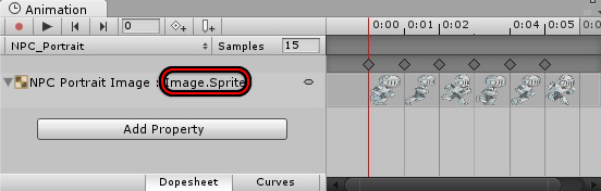
To use animated sprites instead of static textures for portrait images:
AnimatorPlay(Talking, NPC Portrait Image);
AnimatorPlay(Idle, NPC Portrait Image)@{{end}}
The sequence above plays the character's "Talking" animator state on the NPC Portrait Image GameObject. At the end of the duration determined by the length of the dialogue text, it plays the character's "Idle" animator state.Tip:
speakerportrait and listenerportrait to refer to the current speaker's and listener's portrait images. This way you don't have to assign unique names to the portrait image GameObjects and specify them by GameObject name.The Dialogue System includes sophisticated typewriter effects for Unity UI and TextMesh Pro that you can add to your subtitle text elements. Tooltips explain each property. Some additional notes are below.
Characters Per Second specifies how fast to type. Make sure this value is no faster than the Dialogue Manager's Subtitle Chars Per Second; otherwise the subtitle may disappear before it's fully typed out.
The typewriter effect handles rich text codes and these special time control codes (aka RPG Maker-style codes):
| Code | Function |
|---|---|
| \. | Full pause (default: 1 second). |
| \, | Quarter pause (default: 0.25 second). |
| \> | The following text is instant. |
| \< | The following text is no longer instant. |
| \^ | Skip to the end. |
The typewriter effects have UnityEvents that run when the typewriter starts, prints a character, and ends. To configure autoscrolling for large blocks of text, you can set the OnCharacter() event to move the scrollbar to the bottom, or enable the Auto Scroll Settings section. To use Auto Scroll, see Autoscroll Setup.
The typewriters also send the sequencer message "Typed" when done. Your sequences can listen for this message to run commands as soon as the typewriter is done. (See Cutscene Sequences and Built-in Messages.)
To add Auto Play and Skip All functionality to your dialogue UI, add a Conversation Control component. Call ConversationControl.ToggleAutoPlay to toggle auto play and/or ConversationControl.SkipAll to skip to the next player response menu. For example, you can configure UI buttons' OnClick(0 events to call those methods.
To localize a Text element (such as a "Continue" button) or the options of a Dropdown element, add a Localize UI component. You can assign a Text Table to this component. If none is assigned, it will pull the localized text from the Text Table assigned to the Dialogue Manager. You do not need to do this for text in your dialogue database such as conversations and quests. Dialogue databases contain their own localization. For more information, see Localization.
To use a different font for each language, see Localized Fonts.
The Dialogue System's Standard UI system natively supports TextMesh Pro as well as regular UI Text. Depending on the version of Unity and TextMesh Pro you're using, you may need to add TMP_PRESENT to your project's scripting define symbols to enable support. To do this, open the Welcome Window (Tools → Pixel Crushers → Dialogue System → Welcome Window) and tick Enable TextMesh Pro or select menu item Tools → Pixel Crushers → Dialogue System → Tools → Enable TextMesh Pro Support....
If you want to add the TMP_PRESENT symbol manually instead, select Edit → Project Settings → Player. In the Other Settings section, add TMP_PRESENT to the Scripting Define Symbols field. If this field already contains text, put a semicolon between the existing text and TMP_PRESENT.
If the TextMesh Pro Typewriter Effect still isn't available after adding the symbol, right-click on Plugins ► Pixel Crushers ► Dialogue System ► Scripts and click Reimport. Then do the same for Plugins ► Pixel Crushers ► Dialogue System ► Wrappers.
If you want to adapt one of the existing prefabs for TextMesh Pro, add an instance of the prefab to a Canvas in your scene, such as the Dialogue Manager's Canvas.
When you add the template to the scene (in a Canvas), the Standard Dialogue UI, Standard UI Subtitle Panel, or Standard UI Menu Panel fields will look like this:

Unassign the field. The field will change into this:

Then you can remove the UI Text component from the NPC Subtitle Line GameObject, add a TextMeshProUGUI, and assign it to the field. If you want to use a typewriter effect, you can also remove the Unity UI Typewriter Effect from the GameObject and add a Text Mesh Pro Typewriter Effect.
Each build platform has its own set of Scripting Define Symbols. If you change build platforms (e.g., from Standalone to iOS), select this menu item again.
Note: The evaluation version is compiled without TextMesh Pro support.
The Dialogue System's Standard UI system natively supports Kai Clavier's Super Text Mesh as well. To enable support:
Clavian folder into the project's Plugins folder. This is a requirement in order to give the Dialogue System (which is in the Plugins folder) access to Super Text Mesh.You will then be able to assign Super Text Mesh elements to Dialogue System UIs similarly to TextMesh Pro support described above.
If you want to add the USE_STM symbol manually instead, select Edit → Project Settings → Player. In the Other Settings section, add USE_STM to the Scripting Define Symbols field. If this field already contains text, put a semicolon between the existing text and USE_STM.
Note: The evaluation version is compiled without Super Text Mesh support. However, you can import the SuperTextMesh Support package found in the Third Party Support folder to use the legacy version of Super Text Mesh support.
UI Toolkit support is currently in beta release and supports Unity 2021+.
A basic dialogue UI prefab is in Plugins ► Pixel Crushers ► Dialogue System ► Prefabs ► UIToolkit Prefabs ► Basic. This is a prefab version of the dialogue UI created in the setup video:
Video: UIToolkit Setup Video (beta)
A UI Toolkit dialogue UI uses the UI Toolkit Dialogue UI component and works with three separate UI documents: Alert, Dialogue, and QTE.
The Alert document should contain a root container, an optional alert panel and background image, and a label for the alert text. Enter the exact names for these elements in the UI Toolkit Dialogue UI component.
The QTE document is optional. You can omit it if you don't use QTEs. It should have a root container and elements for each QTE. Enter the QTE elements' names in the dialogue UI's QTE Elements section.
The Dialogue document should contain a dialogue panel containing two subtitle panels – one for NPC, one for PC – and a response menu. Each subtitle panel has a container, a subtitle label for the subtitle text, and some optional elements: a continue button and a portrait name and image. Note that the elements all have unique names, which you must enter exactly in the UI Toolkit Dialogue UI component.
The response menu may contain an optional portrait image and name container, a progress bar for the timer (in case you set timeouts for your menus), and a number of response buttons. You'll need to add a number of buttons here to hold the maximum number of responses that any single menu can have in your game. Note that they, too, should all have unique names.
The subtitle panels should be listed in the Subtitle Panel Elements list. Each is indexed starting from 0, so the first panel in the list has index 0. Normally this means you will set the NPC Subtitle Panel Index to 0 and PC Subtitle Panel Index to 1. You can also define extra panels with indices 2, 3, etc. As with Unity UI, you can use these extra panels using the panel markup tag, SetPanel() sequencer command, or Dialogue Actor components.
In Response Menu Elements, enter the element names just as they are in the UI document.
The Dialogue System still supports the older Unity UI Dialogue UI component as well as the Legacy IMGUI Unity Dialogue UI, TextMesh Pro Dialogue UI, and others in the Third Party Support folder. The older Unity UI and legacy GUI prefabs are in Prefabs ► Deprecated.
To override the dialogue UI used in conversations involving an actor, add an Override Dialogue UI component to the actor's GameObject. To override all of the Dialogue Manager's display settings, including the dialogue UI, add an Override Display Settings component instead.
You can also override certain display settings on a per-conversation basis by inspecting the conversation's properties in the Dialogue Editor.
If you only want to specify that the actor use a specific panel in the regular dialogue UI, set the panel on the actor's Dialogue Actor component.
For other dialogue UI questions, such as how to set up UIs in VR or how to handle notched displays, see the User Interfaces section of the FAQ page.
A bark UI is typically on a world space canvas positioned above the barker's head, but it can also be on a screen space canvas. It has these properties:
| Property | Function |
|---|---|
| Canvas Group | The bark panel's canvas group, used to show/hide the bark UI. Not mandatory. |
| Bark Text | Used to show the bark text. |
| Name Text | Used to show the barker's display name. Not mandatory. |
| Include Name | Prepends the name to the Bark Text. Don't tick this if you're using Name Text, as that would be redundant. |
| Portrait Image | Optional Image to show barker's portrait. Note: Barks do not support the SetPortrait() sequencer command. Use the [pic=#] markup tag instead. |
| Show Portrait Image | Show portrait in Portrait Image. |
| Animation Transitions | Optional animator triggers to show and hide the bark UI. |
| Duration | Default duration in seconds to show the bark. |
| Keep In View | Keeps the bark UI's anchor within view of the camera. |
| Wait Until Sequence Ends | Keeps bark visible until its Sequence ends. |
| Wait for Continue Button | If bark UI has a continue button, wait for it to be clicked. Configure the button's OnClick() event to call the bark UI's OnContinue() method. |
| Text Display Setting | Specifies when to show bark text. Same As Dialogue Manager uses Dialogue Manager's Subtitle Settings. |
The Prefabs ► Standard UI Prefabs folder contains two bark UI templates:
You can add a Bark Group Member component to a GameObject to configure it as a member of a bark group. When one member of a group barks, the other members will hide any active barks.
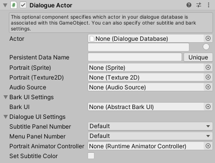
To associate a GameObject with an actor in your dialogue database, add a Dialogue Actor component. Otherwise, the Dialogue System will search the scene for a GameObject whose name matches the actor's name, for example to cut the camera to a closeup of the actor.
You can also use Dialogue Actor to configure how the actor interacts with the dialogue UI:
| Property | Function |
|---|---|
| Portrait | If assigned, overrides the actor's portrait in the dialogue database. |
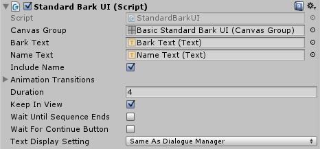
| Bark UI Settings | A bark UI prefab to instantiate as a child of the GameObject. Use this if your actor uses barks. A good default to start with is the prefab Prefabs ► Standard UI Prefabs ► Templates ► Basic ► Basic Standard Bark UI. |
| Dialogue UI Settings | Lets you specify which subtitle and/or response menu panels to use for this actor. You can also specify an animator controller to use for animated portrait images and a custom color to use for subtitle text. |
When deciding which menu panel to use, the Dialogue System will give preference to the player's menu panel. If the player is configured to use the default menu panel and the other participant (e.g., NPC) specifies a menu panel, the Dialogue System will use the NPC's menu panel.
The Input Device Manager is an optional component that's included on the Dialogue Manager prefab. It provides several features such as ensuring that a UI button is focused when using a joystick so the player can navigate between UI buttons.
The Input Device Manager abstracts input so that the Dialogue System isn't tied to any specific input mechanism. In addition to Unity's built-in input manager, it supports Unity's new Input System package, Rewired, and any other input mechanism if you assign your own methods to the Input Device Manager's delegates.
For details on using Rewired, see Rewired Support.
For details, on using the Input System package, see the Input Device Manager's separate manual in Assets / Plugins / Pixel Crushers / Common / Documentation and/or the example in the Dialogue System's Demo folder.
In general, the Standard Dialogue UI system just uses Unity UI's EventSystem to navigate and select buttons during conversation. Make sure your EventSystem GameObject is set up for whatever input mechanism you're using. If you're using the Input System package, inspect the EventSystem GameObject and make sure it's using a properly configured InputSystemUIInputManager component.
To use the Input System for other input – such as the Selector or Proximity Selector's Use Button, or a UI Button Key Trigger component's Button field – you'll need to add a short script to the Dialogue Manager. The Input Device Manager's manual (in the Common / Documentation folder mentioned above) provides a template script.
If your game uses multiple EventSystems for multiple players in a local multiplayer game, add a Set EventSystem component to each player's Canvas or UI hierarchy, and assign an EventSystem. Dialogue System UIs in the hierarchy will use the specified EventSystem.
<< Welcome to the Dialogue System for Unity! | Logic & Lua >>