 |
|
Component > Pixel Crushers > Dialogue System > UI > Standard UI > Dialogue > Standard UI Menu Panel
Placed on a menu panel that will be used by a Standard Dialogue UI.
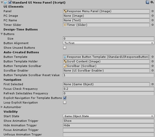
| Property | Function |
|---|---|
| Panel | The main panel. Not mandatory. |
| PC Image | Used to show the player's portrait image. Not mandatory. |
| PC Name | Used to show the player's display name. Not mandatory. |
| Timer Slider | Used to show the time left if a response menu timeout is set. Not mandatory. |
| Design-Time Buttons | — |
| Buttons | List of buttons to use for responses. Not mandatory if using Button Template. |
| Button Alignment | If not all buttons are needed, align to the first in the list or the last. |
| Show Unused Buttons | If not all buttons are needed, show the unused buttons as noninteractive. |
| Auto-Created Buttons | — |
| Button Template | Template from which to auto-create response buttons. |
| Button Template Holder | Panel that auto-created buttons will be added to. |
| Button Template Scrollbar | Scrollbar if Button Template Holder is part of a ScrollRect. Not mandatory. |
| Scrollbar Reset Value | When showing a new menu, reset scrollbar to this value. |
| Navigation | — |
| First Selected | In joystick/keyboard mode, start UI navigation on this element. |
| Focus Check Frequency | On this frequency, ensure that some UI element is focused for navigation. |
| Refresh Frequency | On this frequency, refresh the cache of navigable UI elements. |
| Explicit Navigation | Set button UI navigation to Explicit and restrict navigation to the buttons. |
| Loop Explicit Navigation | Navigating down from bottom button loops to top, and vice versa. |
| Autonumber | Autonumber buttons and assign shortcut keys. |
| Visibility | — |
| Start State | The starting state of the panel. |
| Animation Triggers | Animator triggers to control panel visibility (see Panel Animation). |
For details about the Standard Dialogue UI system, see: Standard Dialogue UI.