 |
|
The Dialogue System includes a WYSIWYG Unity GUI system. You can use it to design dialogue UIs and any other UI needs in your project. GUI controls update in the Game View at edit-time so you can edit your GUI layouts interactively. You'll see changes as you make them.
To add a GUI control, use the menu GameObject > Create Other > Dialogue System > Unity GUI. The top level control must be a GUI Root.
All controls are positioned inside their parent. The position and size of a control are specified by a Scaled Rect. Scaled Rects give you a lot of flexibility in positioning your controls. You can specify units in two scales:
| Scale | Description |
|---|---|
| Pixel | Units are measured in pixels |
| Normalized | Units are in the range 0 to 1, where 1 is the entire area |
Normalized units allow you to scale GUI controls relative to the screen size. The control's area is relative to the size of its parent's area, or the screen if the control doesn't have a parent. The value 1 is the entire parent area, and 0.5 is half of the area. So if the parent fills half the screen, then a normalized value of 1 means half the screen, not the whole screen.
The position is specified by an Origin and Alignment:
| Property | Description |
|---|---|
| Origin | Specifies which part of the parent to align to |
| Alignment | What corner of the control is aligned to the Origin point |
In addition, you can tell a control to automatically fit itself relative to its siblings by assigning Fit properties:
| Fit | Description |
|---|---|
| Above | Position yourself directly above the assigned control |
| Below | Position yourself directly below the assigned control |
| Left Of | Position yourself directly to the left of the assigned control |
| Right Of | Position yourself directly to the left of the assigned control |
Finally, the Depth property determines whether controls get drawn on top of or underneath other controls. To take advantage of depth, make sure the parent control's Depth Sort Children property is ticked.
These GUI Controls are available:
The top level control. You should only have one of these in a layout, and it should be on the topmost GUI Control game object.
Draws a texture. GUI Images can be animated. See Animated Images.
Draws a text and/or image label. Images assigned to GUI Labels can be animated. See Animated Images.
Draws a button. Provides these features beyond a regular GUI.Button:
A progress bar; also used as a timer bar if your response menu has a timeout.
An invisible control (used to hold a collection of child controls).
A scroll view area. Child controls are displayed inside the scroll area.
A GUI Window.
A text input field. If you want to prompt for text input during conversations, see Text Field UI.
If you use Localization, you can assign a localized text table to any control that has a text property. If you do, then the control will use the value of the Text property as the lookup value in the localized text table.
You can add GUI effects to your controls to modify they way they appear. Currently the effects play when the control becomes active. In the future, additional triggers such as closing, hovering, etc., may also be supported. To add an effect, select it from Component > Dialogue System > UI > Unity GUI > Controls > Effects.
These GUI Effects are available:
Fades the control in and/or out.
Slides the control onscreen from a specified edge.
Adds the text content character by character, as if it were being typed in realtime. This effect uses its own Characters Per Second setting instead of the Dialogue Manager's. You can also assign an optional audio clip to play on each character.
Flashes the control off and on. The prefabs use this effect for QTE indicators.
Add to a progress bar control to make it count down from 1 (full) to 0 (empty) over a specified duration.
Changes the behaviour of the continue button (if you use one) so that the first click skips to the end of the typewriter effect, and the second click actually continues to the next stage in the conversation.
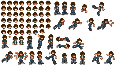
You can configure GUI Labels and GUI Images to perform cel-based (spritesheet) animation. You can use this to animate portrait images in your dialogue UIs. To do this:
(Source: Public domain sprites from http://pd.sprites-inc.co.uk/Crossover/Space_Cowboy/kiba3ns.png)

<< Unity GUI Dialogue UI Prefabs | How to Set Up the Player (PC) >>