 |
|
The video tutorials are recommended for dialogue UI topics.
This tutorial demonstrates how to customize a dialogue UI. We'll start with the Basic Standard Dialogue UI template, reposition some elements, and apply textures.
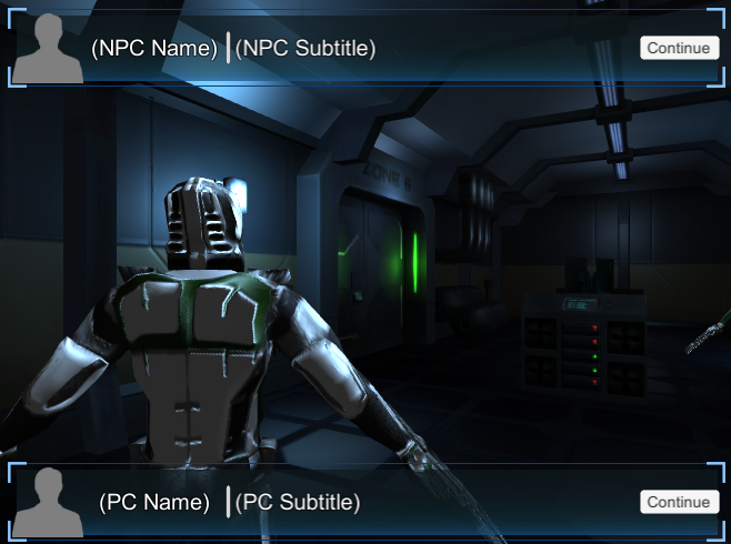
Step 1. To start, make a copy of DemoScene1 and open it. Assign the prefab Prefabs ► Standard UI Prefabs ► Templates ► Basic ► Basic Standard Dialogue UI to the Dialogue Manager's Display Settings → Dialogue UI field. When prompted, select Add Instance instead of Use Prefab. This will add an instance to the Dialogue Manager's Canvas. The UI looks like this:
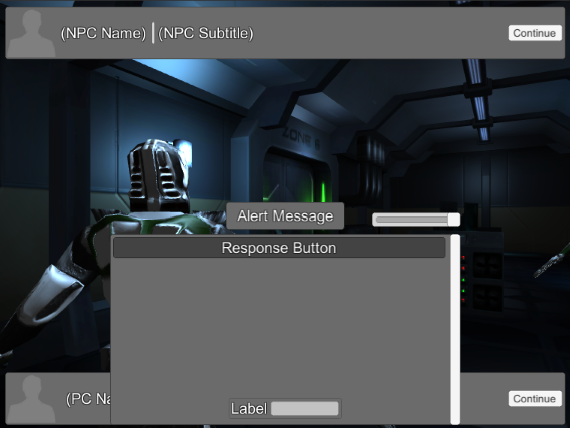
The NPC Subtitle Panel is at the top, the PC Subtitle Panel is at the bottom, and the Response Menu Panel is centered at the bottom.
Step 2. The Alert Panel is in the center of the screen. We'll customize this first. Inspect the Alert Panel. Set the Rect Transform to these values:
Set the Image to these values:
Set the Animator to these values:
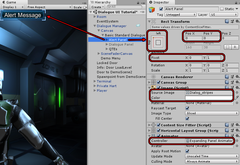
The Expanding Panel Animator Controller expands the panel to its full size. You could just as easily assign your own animator controller that plays a different animation such as sliding the panel onto the screen.
In the screenshot above, the Dialogue Panel was temporarily deactivated to make it easier to see the Alert Panel.
These settings give the Alert Panel a clean sci-fi look in the top left corner of the screen.
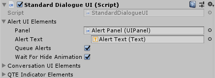
The Alert Panel is assigned to the dialogue UI's Alert UI Elements:
Next, we'll work on the Dialogue Panel's subtitle panels.
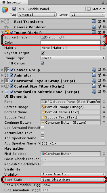
Step 3. Activate the Dialogue Panel if you deactivated it. Inspect NPC Subtitle Panel. Set the Image to these values:
Set the Standard UI Subtitle Panel component's Visibility to Always From Start.
Step 4. Apply the same settings to PC Subtitle Panel. At this point, with the Alert Panel and Response Menu Panel temporarily deactivated, your dialogue UI should look like this:
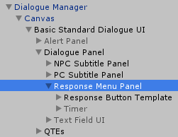
Note that the Standard UI Subtitle Panel component is a separate component from Standard Dialogue UI. Unlike the Alert Panel, which is configured on the Standard Dialogue UI, you'll configure each subtitle panels on its own Standard UI Subtitle Panel and then assign it to the Standard Dialogue UI as shown below:
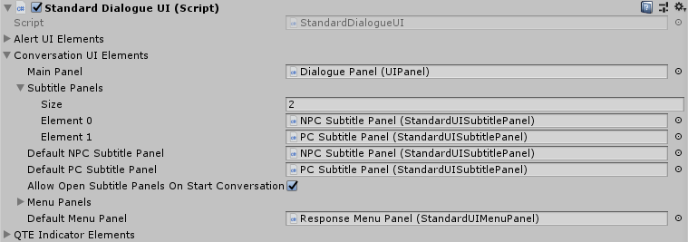
They don't even need to be children of the same Canvas. As long as they're assigned to the Standard Dialogue UI's Conversation UI Elements → Subtitle Panels list, the Standard Dialogue UI will be able to use them. Note that each panel has an element number, starting from 0 (zero). Actors can use a Dialogue Actor component to specify which subtitle panel their content should display in. If the actor doesn't have a Dialogue Actor component, or if the Dialogue Actor specifies to use the default subtitle panel, the actor will use the panel assigned to Default NPC Subtitle Panel or Default PC Subtitle Panel.
Each Standard UI Subtitle Panel component has several options:
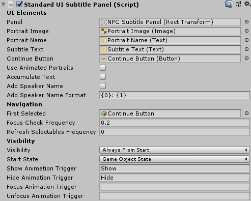
The UI Elements fields are where you'll assign the UI elements.
The Navigation settings control joystick and keyboard navigation.
The Visibility settings control when and how the panel appears.
Last, we'll work on the Dialogue Panel's menu panel.
Step 5. Let's put the response panel in the middle of the screen and omit the scroll rect. Move Response Button Template directly under Response Menu Panel, and delete the Scroll Rect and Scrollbar:
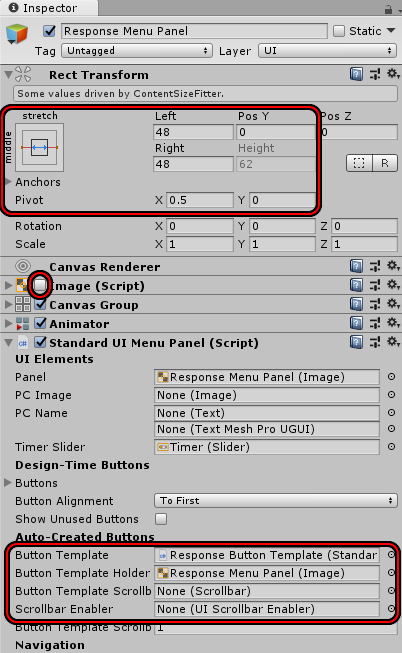
Step 6. Inspect the Response Menu Panel. Set the Rect Transform to these values:
Disable the Image.
Set the Animator's Controller to Expanding Panel Animator Controller.
Assign the Response Menu Panel to the Standard UI Menu Panel's Auto-Created Buttons → Button Template Holder:
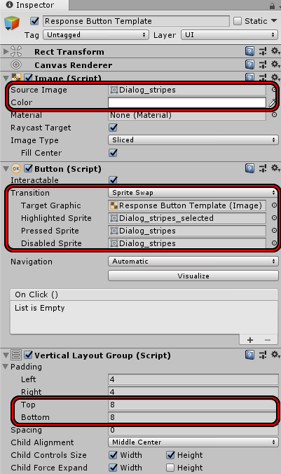
Step 7. Inspect the Response Button Template. Set the Image to these values:
Set the Button component to these values:
Set the Vertical Layout Group to these values to give the text a little more breathing room:
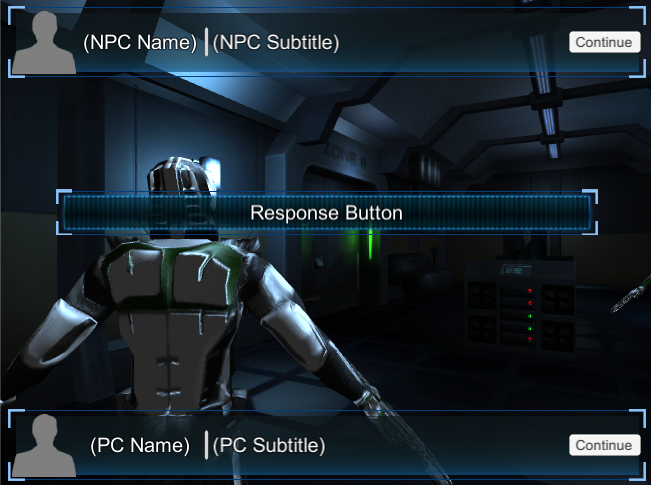
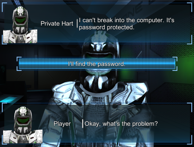
Your dialogue UI should now look similar to this:
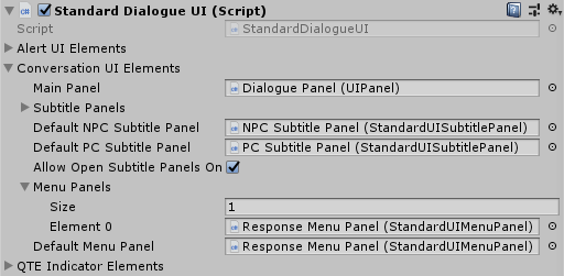
Similarly to subtitle panels, the menu panel uses a separate Standard UI Menu Panel component that's assigned to the Standard Dialogue UI:
Step 8. Since we're showing the PC Subtitle Panel, let's make sure conversations use it. Inspect the Dialogue Manager, tick Display Settings → Subtitle Settings → Show PC Subtitles During Line, and untick Skip PC Subtitle After Response Menu.
Then play your scene to see your custom UI:
The Standard Dialogue UI system supports many options not covered in this tutorial. For example, the WRPG UI accumulates text during the conversation so the player can scroll back to review old lines. The Bubble UI uses cartoon bubbles above the participants' heads.
The best way to start customizing your own dialogue UI is to experiment with the provided templates. Find one that works similarly to your desired design and customize it.
<< Tutorials